
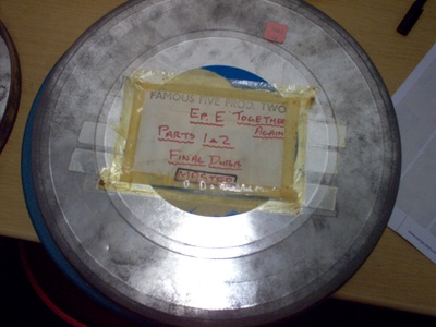
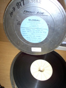
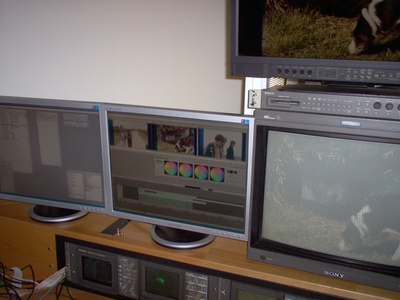
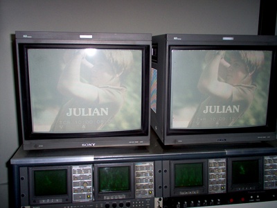
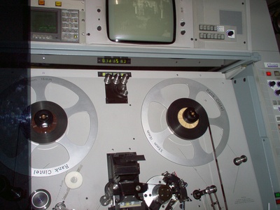
| The Complicated Search for Distribution Rights | Processing the "1978/79 Famous Five" Footage |
| Readers' Survey | Booklet |
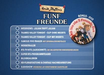
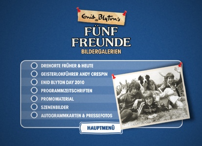
| Bonus Material |

Wherever there's adventure to be found
Just a clue or a secret message
bring the Famous Five around.
Whenever there's a mystery to be solved
Up in the ruined castle
or down in smugglers' hold.
We are the Famous Five
Julian, Dick and Anne,
George and Timmy the dog.
We are the Famous Five
Coming back to you,
time after time,
after time.

| Are you also interested in a Blu-Ray edition of the series that contains substantial extra bonus material? | |
|---|---|
| Yes | 80.37 % |
| No | 13.08 % |
| Don't know | 6.54 % |
| Would you like the Blu-ray edition to be issued in autumn this year with Seasons 1 & 2 at the same time as the Collectors' Box ? | |
| Yes | 86.25 % |
| No | 5 % |
| Don't know | 8.75 % |
| I want to buy the Blu-ray edition 3 or 4 months later, after the Collectors' Box has come out. | |
| Yes | 32.47 % |
| No | 40.26 % |
| Don't know | 27.27 % |
| Would you be prepared to pay € 60-80 for a Blu-Ray edition with all 26 Famous Five adventures in 650 minutes of top HD quality and fantastic bonus material? | |
| Yes | 50.67 % |
| No | 33.33 % |
| Don't know | 16 % |
| Which of the 4 DVD cover versions for "The Famous Five" Box 1 (Episodes 1-13) and Box 2 (Episodes 14-26) do you like best? | ||
|---|---|---|
Version 1: 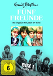 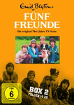 |
20.49 % |
As with Version 1, the Famous Five are shown in black and white on the cover. Adventurous depiction with the black and white picture below. Choice of pictures and layout. Is the most modern type of the 4 versions with the adventurous black and white picture below. B/w design displayed below, colour picture may be larger. The lesser evil. |
Version 2: 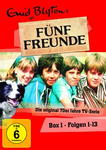 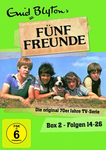 |
48.93 % |
Modern design "Do-it-yourself look" Unlike the first alternative, there are not two group pictures on one cover. You can see scene photos! Beautiful photos, beautiful colours!!!! Somehow fits the time in which the series is set. Attractive design, but rather than red and green, use colours matching the group picture. Attractive design. I preferred the group photo with Timmy in the first version though. :) Simple, clear and not so playful. Is the simplest of all the options and doesn't look so homemade. The skin colour in Version 2, which I chose, is not natural enough. Please improve it. Is the most eye-catching, promises maximum attention / recognition value. Authentic design from the '70s - please nothing hip at the time! Typography and PR phrases included. The best of a bad bunch. |
Version 3: 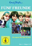 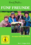 |
19.88 % |
Clear lines Many photos Clear lines and many photos :0) Doesn't resemble the covers of the '96 series. Large photo that is not chopped up by small ones. Every detail stands out! Caption, several photos, good lettering, number of episodes. The choice of photos. Spontaneously reminds me of the blue opening credits design of our favourite series. |
Version 4: 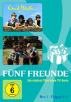
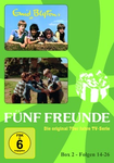 |
4.28 % |
Images Background graphics. Inclusion of the stylised "freeze frame" from the opening credits. |
| None | 6.42 % |
I dig traditional. Has nothing to do with the flair of the '70s series! Sorry, I'm a nostalgist, not a six-year-old!!! The background colours aren't right at all! Better to keep it simple, like opening credits, without extra pictures, maybe a "treasure map" appearance. If you're going to all this trouble, the covers shouldn't look like an 08/15 release. A bit more creativity. Combination of Versions 1 and 2, and more suitable background colours. |
| Which of the 4 DVD "Collector's Edition" (Episodes 1-26) cover versions do you like best? | ||
Version 1: 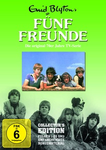 |
19.91 % |
Adventurous depiction of the B/W picture below with white lettering & overall bright
green colour. Similarity to the appearance of the original series design. Mixture of Versions 1 and 2 would be ideal. Overall appearance--> colour could be more decent (semi gloss, pastel tone, darker). Black & white picture below great, but colour picture could be bigger. |
Version 2: 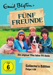 |
52.49 % |
Presentation Good: Doesn't have 2 group pictures. Bad: Not right for the age of the series (0815 design, gaudy colours). Colour selection Clear design, in spite of attractive Famous Five logo, a beautiful picture of the Five! Very attractive design (paper + sticky tape), good lettering and only 1 group picture. This is my favourite picture of the Five :) .... I absolutely love it. Good in principle, but background colour doesn't go with the rest! The normal "Famous Five" lettering and picture with the Five on the cliff would be better. |
Version 3: 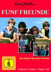 |
14.48 % |
Photos Straightforward, lots of photos, looks orderly, doesn't resemble the covers for the '96 series. Very good overall impression!!!! Everything fits and is in harmony. |
Version 4: 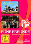 |
3.62 % |
Anniversary appearance Images |
| None | 9.5 % |
I dig traditional Has nothing to do with the flair of the '70s series! Sorry, I'm a nostalgist, not a six-year-old!!! Colours are much too garish. I like Version 3 best. The background just has to have the colour of Version 2. Looks badly photoshopped - less garish and less crammed would be better. Version 4 against a blue background, or Version 1 without the middle picture and with a grey-blue background. Combination of Versions 1 and 2, and more suitable background colours. |
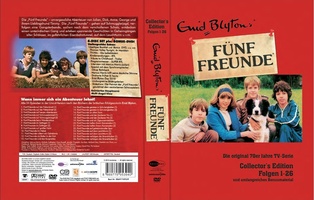 Cover Pack Exterior | ||||
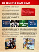 Page 4 |
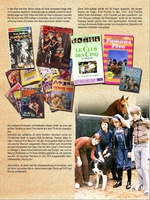 Page 5 |
 Page 12 |
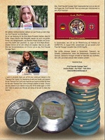 Page 13 |
 Page 16 |
